The Challenge
The challenge was to create a logo system that captured the balance between clinical wellness and southern hospitality. Rooted in South Louisiana and founded by two women, the brand needed an identity that felt modern and established within the peptide and GLP-1 space without losing its warmth, personality, and sense of community.
The Solution
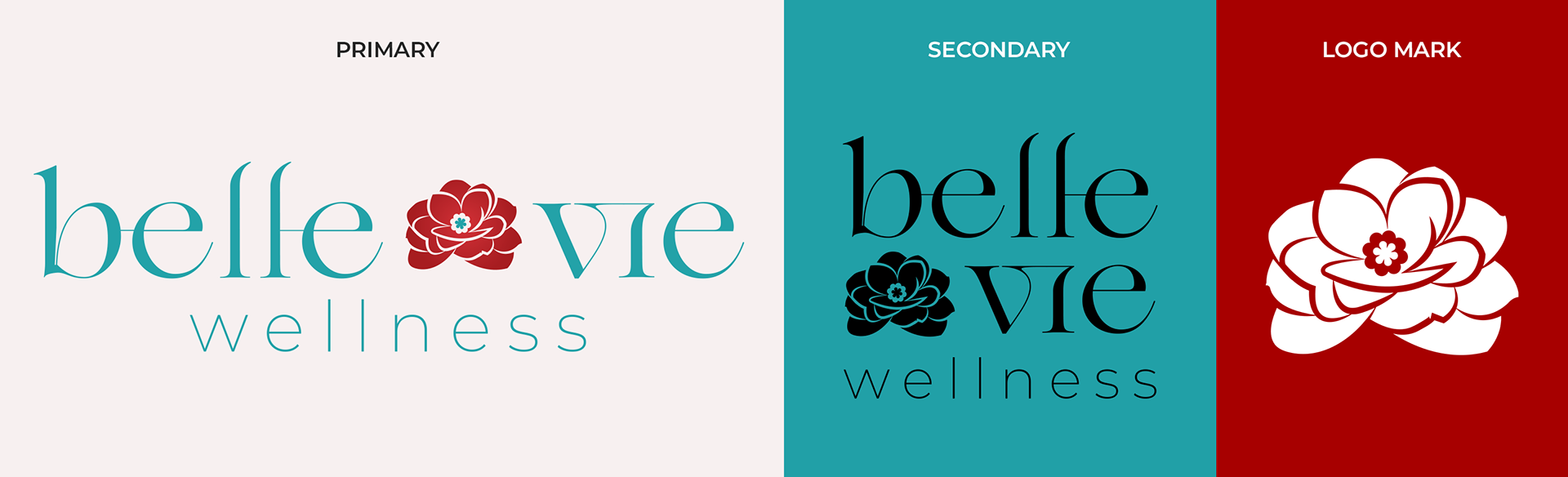
Design Library
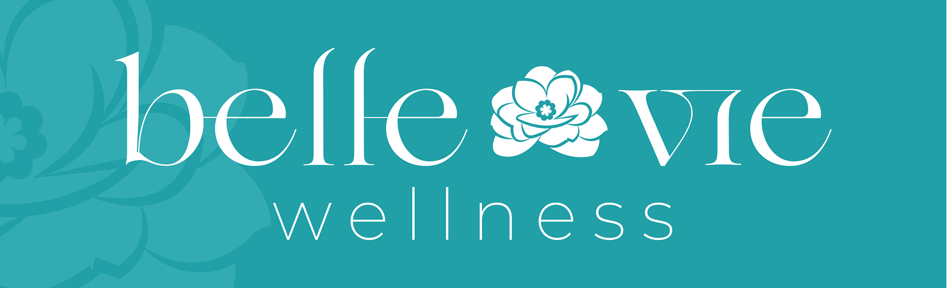
The solution centers around the Camellia flower as the main logo mark, a flower that is both locally recognizable in South Louisiana and tied to ideas of vitality and growth. Paired with an elegant typeface, the identity feels polished while still holding onto the warmth and charm of the South. The color palette also helps reinforce the brand personality. A bold turquoise serves as the primary color to create a sense of peace and calm, while a vibrant red secondary color brings in energy, health, and vitality. The final logo balances the wellness space with the brand’s local roots while staying true to the founders’ mission.
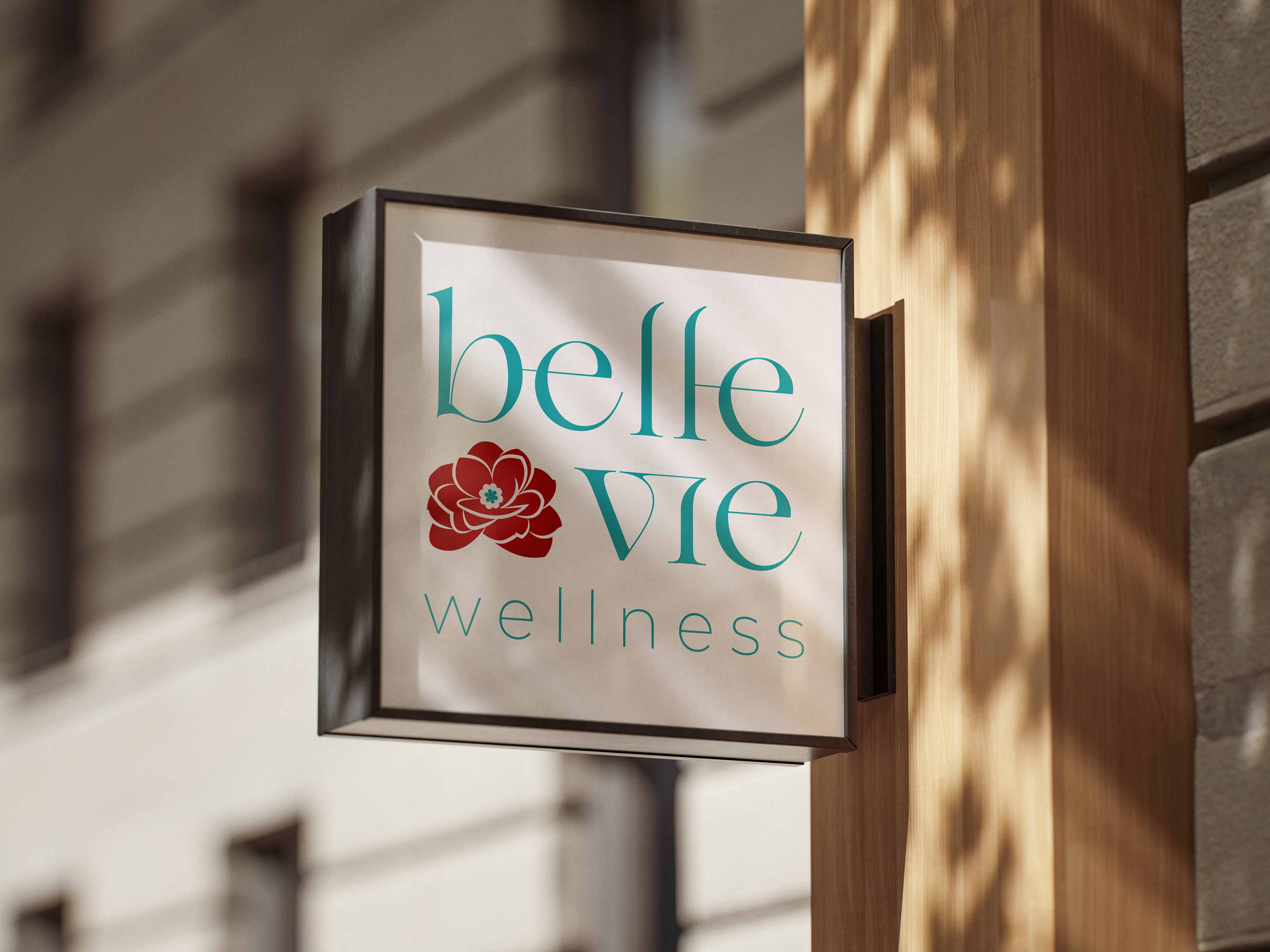
Branding In Action